From craft serum to retail-ready beauty brand.
A full brand refresh for a small handcrafted skincare line — new identity, product naming, packaging design, and visual system. The product was good. The packaging was hiding it.
A full brand refresh for a small handcrafted skincare line — new identity, product naming, packaging design, and visual system. The product was good. The packaging was hiding it.
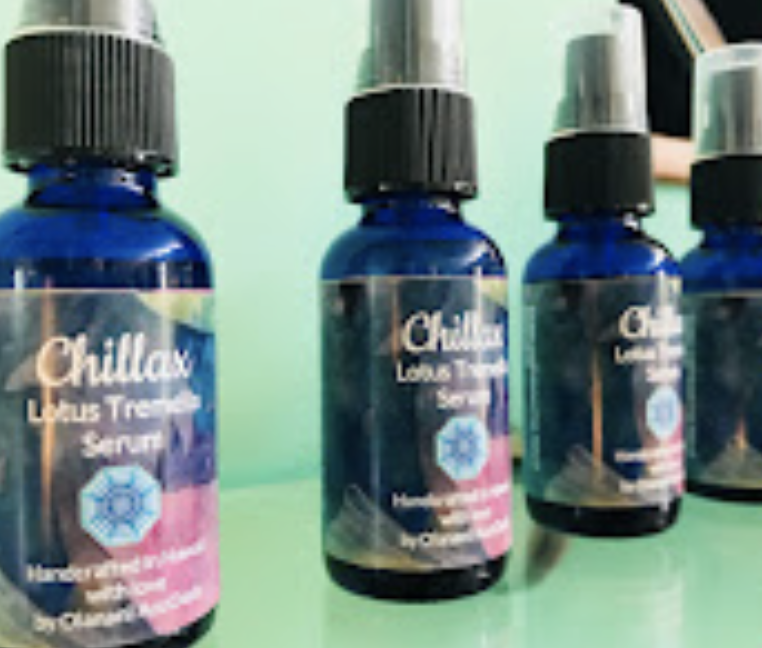
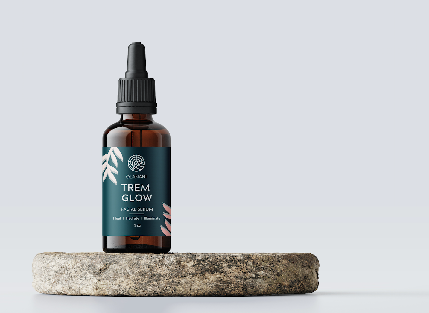
A casual, hand-lettered name on a homemade-looking label became a refined leaf-and-sun emblem with proper typography — the kind of brand mark that earns shelf space.
The original serum was a quality product. But the packaging told a different story.
A brand refresh isn't a fresh coat of paint. It's a rewrite of the story a customer tells themselves before they even open the bottle. Identity, naming, packaging, and photography work together to signal quality, build trust, and give the product visual permission to be priced like a premium item.
That's the work I love. Taking something that's already good and giving it the visual credibility to sell.
New logomark, wordmark, and visual system — built around natural botanicals and a calming, premium palette.
Renamed the product line under the new umbrella — clearer, more descriptive, and easier to extend to future SKUs.
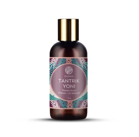
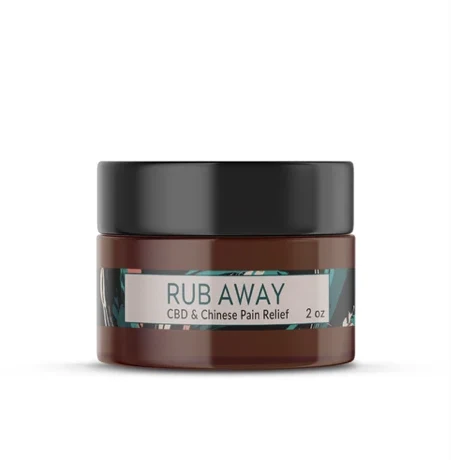
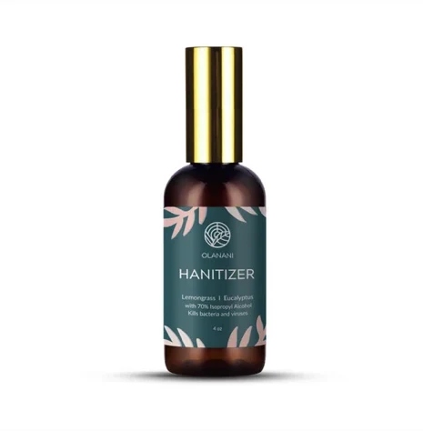
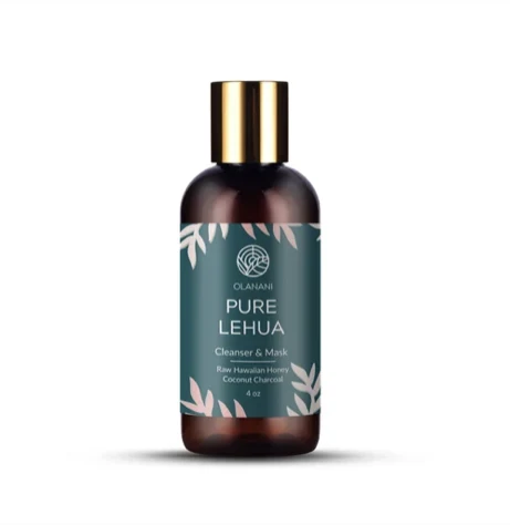
Bottle labels and product packaging redesigned end-to-end. Cleaner typography, stronger hierarchy, retail-shelf-ready.
Art-directed the product photography — neutral backgrounds, natural materials, soft lighting. The kind of imagery a buyer expects from a premium brand.
Built the entire e-commerce site end-to-end on Shopify — product pages, checkout, brand storytelling, mobile-optimized. The whole online store, ready to sell.
Brand work doesn't stop at the bottle. We built the full e-commerce experience — every page, every product, every line of copy, every checkout flow — and shipped it on Shopify.
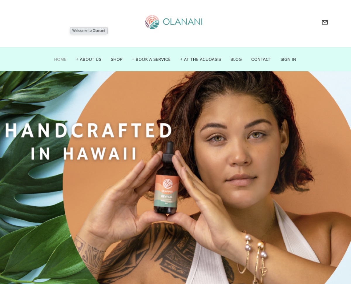
Four SKUs, one visual system. New naming, new labels, new photography — every product now reads as part of the same premium brand.
If your packaging, identity, or brand presence is holding the product back — let's talk about what a refresh would look like.